Morocco: When Red Breaks into Rhythm

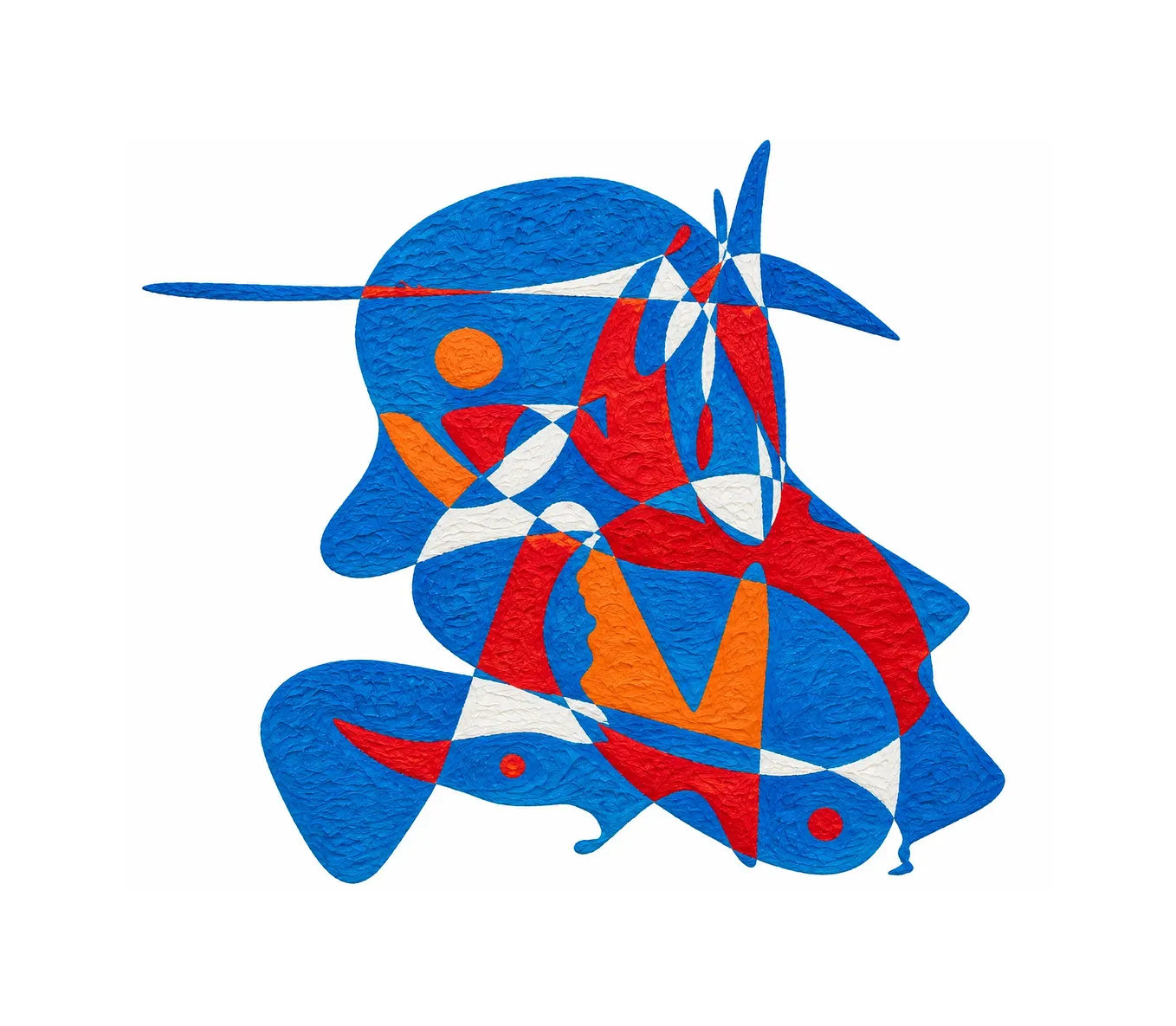
Gheorghe Virtosu’s work 37 of 249 moves from a densely gathered centre into a sequence of slender red forms, making separation part of its momentum.
At the right edge of Morocco, red seems to accelerate. Long, narrow forms extend across the white, their pointed ends carrying the eye beyond the densely interlocking shapes on the left. The spaces between them widen and contract. What begins as a substantial concentration of colour becomes a sequence of intervals.
This change gives the composition its distinctive rhythm. Red occupies most of the coloured area, yet its behaviour varies dramatically. It broadens into rounded enclosures, contracts into fine projections, and separates into forms that seem poised between attachment and release.
Green passages complicate this outward movement. Embedded throughout the red, they establish smaller centres of attention, drawing the eye back into a composition whose outlines continually encourage it to travel. In Morocco, work 37 of 249 in Gheorghe Virtosu’s Art of the World, expansion and close inspection remain equally compelling.
A gathering that never becomes solid
The left side initially appears to hold the painting’s greatest weight. Its broad red shapes overlap visually, curve around white openings, and descend through a succession of rounded and tapering sections. Their proximity gives this area a concentrated presence.
Yet following its outline reveals how frequently that concentration opens. Near the upper middle, white enters through a deep, curved recess. Farther down, another opening cuts into the red beneath the central green passages. Towards the bottom, a long descending form remains separated from its neighbours by generous white space.
These openings prevent the left side from settling into a single block. Its apparent density comes from many shapes gathering closely, each retaining an edge that the eye can follow.
The upper-left section makes this especially clear. A broad red area extends horizontally, while a narrow point rises above it. A fine white channel divides adjacent red passages, making a small separation unusually conspicuous within the surrounding colour.
This relationship between breadth and incision continues throughout the composition. Wide areas offer visual substance; narrow interruptions keep them active. The eye repeatedly encounters a form that seems complete, then discovers an opening or projection that changes its direction.
Within the red itself, orange and darker variations create further movement. In the supplied image, numerous curled and irregular marks enliven the colour fields. Their activity holds attention inside the shapes even as the contours draw it elsewhere.
Green creates a second route
The largest green passage near the upper left is elongated and rounded, set diagonally within a broad red enclosure. Its clear boundary gives it an immediate presence. It also establishes a recurring relationship: green gathers within red, introducing an interior shape whose direction differs from its surroundings.
Lower down, that relationship becomes more intricate. Darker green, brighter green, and pale mint sections meet around small red areas. Some green forms curve downwards; others cross diagonally or narrow into short extensions.
These variations give green a structural role. It links parts of the image through repetition while creating local differences that reward closer looking. The pale mint passages are particularly effective because they introduce a lighter register within an otherwise saturated palette.
One such passage crosses the lower central section on a diagonal. Its lightness catches attention, but its slant also helps turn the eye towards the right. Nearby, darker green forms bend in other directions, producing a compact exchange of movements.
Along the long red form descending towards the bottom, green appears in a series of separated inclusions. Their sizes increase unevenly, ending in a larger oval near the rounded tip. This sequence gives the descending shape its own internal pace.
Get DV’s stories in your inbox
Join Medium for free to get updates from this writer.
A related effect occurs on the right, where green and mint passages punctuate the broader red extensions. The repetition reaches across the composition, connecting its crowded and more open areas.
Seen this way, green provides a second route through the painting. Red establishes the overall spread; green encourages a slower passage between particular points. The viewer can move across the silhouette quickly, then return through its smaller concentrations of colour.
The right side measures distance
The slender forms on the upper right introduce a pronounced change of tempo. Their elongated profiles leave more white visible between areas of red, making separation increasingly important to the image.
The highest extension reaches furthest to the right. Beneath it, shorter red forms create a staggered sequence. Their angles are close enough to suggest a shared movement, but their lengths and widths differ. That variation gives the group its lively, uneven cadence.
Some intervals are broad and unmistakable. Others narrow towards points of near contact. Looking across them involves a repeated adjustment: the eye joins the shapes through direction, then registers the white that keeps them distinct.
Below this sequence, a broader red passage carries green and pale mint accents towards the right. Its greater width gives it more visual weight than the fine extensions above. A rounded red form hangs beneath its outer section, adding a downward turn to an otherwise outward movement.
That turn matters. It prevents the right side from behaving like a simple release from the crowded left. The composition sends attention outward, then curves it down and back.
Smaller forms beneath the centre perform a related task. Rounded red sections and slender vertical elements create a loose cluster with a rhythm of its own. Their placement extends the painting’s activity below its busiest junction without establishing a firm baseline.
The surrounding white therefore has several functions. It separates, redirects, and gives individual projections room to register. Its changing widths help make movement legible.

A work whose identity lies in relationships
Art of the World, a concept developed by El Arte Monumental, comprises 249 works by Gheorghe Virtosu. Within that larger framework, Morocco brings a country title into contact with an abstract arrangement whose meaning remains open.
The painting’s particularity emerges through relationships that can be observed directly: the concentration of red on the left, the dispersed extensions on the right, the repeated green inclusions, and the white openings that keep the whole arrangement permeable.
These features give the work a recognisable visual character before any wider interpretation begins. Its title adds a reference through which viewers may approach it, while the composition continues to invite attention on its own terms.
For collectors and curators, that combination offers a substantive reason to look closely. The overall silhouette registers quickly, but the internal organisation takes longer to absorb. A pale green crossing, a small inclusion, or a nearly closed white interval can alter the route through the image.
Repeated viewing can also shift the apparent centre of activity. The densely gathered left side may command the first encounter. Later, the fine red extensions can become decisive, making the broader forms feel like the source of a movement still unfolding.
The work sustains both readings. Its colour creates coherence across considerable differences of shape and spacing. Red holds the image together while allowing it to break into distinct rhythms, each with enough independence to change how the whole is seen.
Explore Morocco and the wider Art of the World project on the official website.