E-Commerce Accessibility Audit Checklist: What to Test on Every Page


E-Commerce Accessibility Audit Checklist
An ecommerce accessibility audit checklist is what most teams need before they can start testing with any structure. WCAG organizes its success criteria by principle — Perceivable, Operable, Understandable, Robust — which is logical for a standard but not how you actually test an online store. You test a store by walking through it: homepage, product pages, search and filters, cart, checkout, and order confirmation. This checklist is organized that way — by the page types and interactions that make up a real shopping journey.
Use it as a structured review tool, not a substitute for a full WCAG audit. A complete audit requires automated scanning, manual expert testing, and assistive technology testing. This checklist covers the items that matter most for e-commerce, organized so you can work through your store systematically.
Homepage and Global Navigation
- Skip navigation link present and functional — allows keyboard users to bypass the main menu and go directly to content.
- Main navigation fully keyboard-operable — every link and dropdown reachable and activatable without a mouse.
- Logo links to homepage and has a meaningful accessible name.
- Search input has a visible label (not only a magnifying glass icon).
- Promotional banners and carousels pausable and not auto-advancing in a way that can’t be stopped (WCAG 2.2.2). Carousel controls keyboard-accessible with accessible names.
- Language and region selectors keyboard-operable and labeled.
- Cookie consent banner keyboard-dismissable and doesn’t trap focus.
Product Listing and Category Pages
- Product images have meaningful alt text describing the product (color, style, key visual features) — not “product” or a filename.
- Filter and sort panels fully keyboard-operable — checkboxes, radio buttons, price sliders, and accordion sections all reachable by Tab and activatable by Enter or Space.
- Price range sliders have a text input alternative for users who can’t manipulate a slider.
- Applied filter state is announced to screen readers — user knows which filters are active.
- Pagination has descriptive link text — “Page 2 of results for running shoes,” not bare numbers.
- Product cards announce the full product name, price, and any badge (e.g., “Sale”) to screen readers.
Product Detail Pages
- All product images (main image, alternate views, lifestyle shots) have descriptive alt text.
- Color and size selectors announce their values to screen readers — a color swatch labeled “Navy Blue,” not just a colored circle.
- Quantity selector has a visible label associated with the input.
- “Add to cart” button has a clear accessible name — ideally including the product name (“Add Running Shoe to cart”).
- Cart confirmation announced via
aria-live="polite"region — screen reader users hear "Item added to cart — 3 items." - Product tabs (Description, Reviews, Specifications) use correct ARIA
role="tablist",role="tab",role="tabpanel"patterns with keyboard navigation (arrow keys between tabs, Tab into panel content). - Customer reviews are accessible — star ratings have text equivalents (“4 out of 5 stars”), review text is readable by screen readers.
- Product videos have captions (WCAG 1.2.2 for pre-recorded video).
Search
- Search input labeled with
<label>oraria-label. - Search suggestions/autocomplete keyboard-navigable — arrow keys move through suggestions, Enter selects.
- “No results” state announced to screen readers, not just displayed visually.
- Search results count announced — “24 results for running shoes” so the user knows the scope.
Cart
- Cart contents presented in accessible markup — product name, quantity, and price associated per item (not a grid of disconnected values).
- “Remove” buttons identify which item they remove — “Remove Merino Socks from cart.”
- Quantity update fields labeled and changes confirmed via
aria-live. - Cart total updates announced after any change.
- “Proceed to checkout” button has a clear accessible name.
Checkout
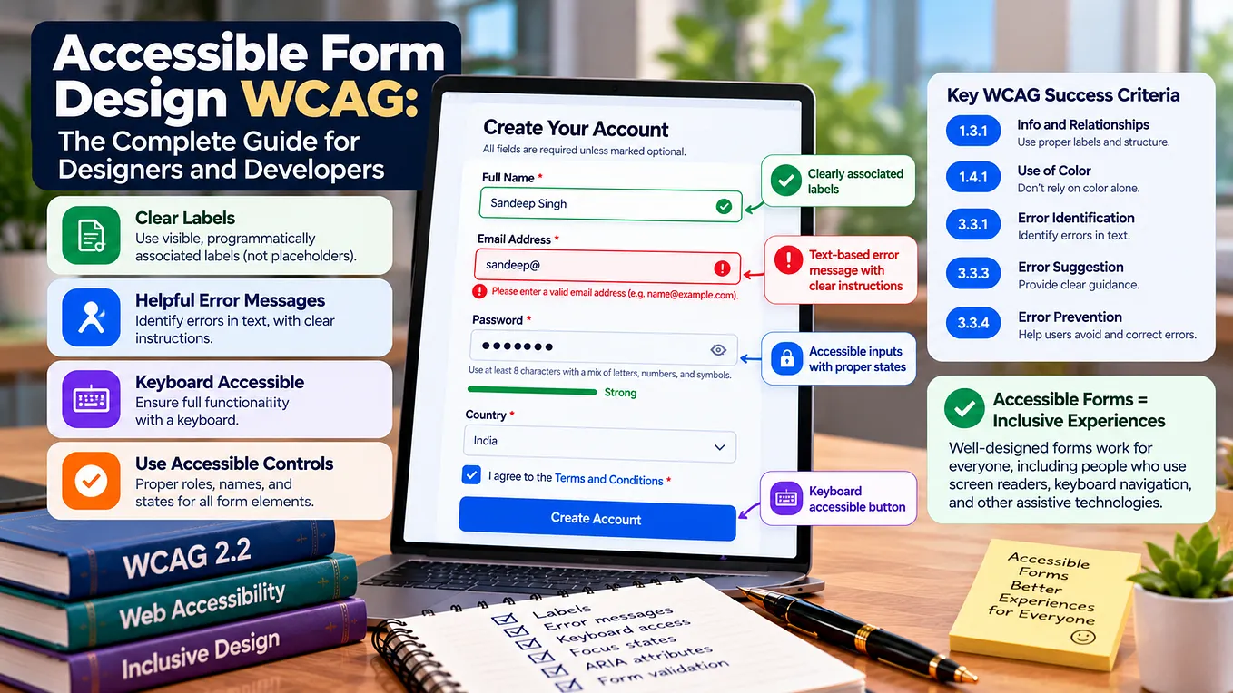
- All form fields have visible, programmatically associated labels.
- HTML
autocompleteattributes on personal and payment fields —given-name,family-name,address-line1,postal-code,cc-number,cc-exp,cc-csc(WCAG 1.3.5). - Error messages identify the field, describe the error in text, and suggest how to fix it (WCAG 3.3.1, 3.3.3).
- Focus moves to the current step when advancing through a multi-step flow.
- Shipping option selector announces carrier, timeframe, and cost — not just a visual tile.
- Payment form errors described in text, not only by color change.
- Order review step present before final submission — allowing the user to verify before committing (WCAG 3.3.4).
- Session timeout warning displayed accessibly before the session expires, with an option to extend (WCAG 2.2.1).
Order Confirmation
- “Order confirmed” message announced as a status message (WCAG 4.1.3) — screen reader users receive confirmation without needing to search the page.
- Order details (items, total, delivery address, estimated delivery) presented in accessible, structured markup.
- Next steps (tracking, account, support) are keyboard-accessible links with descriptive text.
Mobile
- All touch targets at least 44×44 CSS pixels (WCAG 2.5.5).
- All desktop interactions still functional on mobile — keyboard/switch access, screen reader (VoiceOver on iOS, TalkBack on Android).
- No loss of content or functionality in portrait or landscape orientation (WCAG 1.3.4).
- Text resizable to 200% without loss of content or functionality (WCAG 1.4.4).
- Toast/notification messages (“Added to cart,” “Coupon applied”) announced to mobile screen readers.
Site-Wide Checks
- Color contrast meets minimum ratio (4.5:1 for normal text, 3:1 for large text — WCAG 1.4.3).
- No information conveyed by color alone — sale indicators, status badges, stock availability, and price changes use text or symbols alongside color (WCAG 1.4.1).
- All images have appropriate alt text — or
alt=""for decorative images. - Headings follow a logical hierarchy — no skipped levels, no styled text used as a heading substitute.
- Link text is descriptive — no “click here” or “read more” without context.
- Focus indicator visible on every interactive element — don’t suppress browser outlines without providing a custom alternative.
For a deeper look at the methodology behind a thorough accessibility audit — including how automated, manual, and assistive technology testing work together — this overview of web accessibility audits and compliance testing covers the process. And for teams that want specialist evaluators to run the audit, BarrierBreak tests e-commerce platforms across Shopify, Magento, WooCommerce, and custom builds with testers who include assistive technology users.
How to Use This Checklist
- Walk the full purchase journey first — homepage to confirmation — noting where you get stuck by keyboard or where screen reader output is confusing.
- Then work through each section of this checklist on the relevant page type.
- Note severity — items that block a purchase are critical; items that cause friction are important; cosmetic issues come last.
- Automated scanning complements, doesn’t replace. Run a tool like axe or WAVE in addition to this manual checklist.
- Re-test after fixes — with assistive technology, not just visual inspection.
Conclusion
An ecommerce accessibility audit checklist organized by page type — homepage, product pages, search, cart, checkout, confirmation, and mobile — gives teams a practical way to evaluate their store the way customers actually use it. This isn’t a substitute for a full WCAG audit, but it covers the accessibility items that matter most for online retail, in the order you’ll encounter them during a real shopping journey. Walk through it with a keyboard and a screen reader, fix what fails, and you’ll catch the majority of barriers that prevent customers with disabilities from buying from your store.
FAQ
Is this checklist a full WCAG audit? No — a complete WCAG 2.1/2.2 Level AA audit covers 50+ success criteria and requires combined automated, manual, and assistive technology testing. This checklist covers the WCAG items most relevant to e-commerce, organized by page type for practical use. Use it as a structured review tool alongside a broader audit.
Get BarrierBreak’s stories in your inbox
Join Medium for free to get updates from this writer.
Which page type has the most accessibility failures in e-commerce? Checkout and product detail pages consistently have the highest number of failures — checkout because of its form complexity and multi-step flows, and product pages because of image alt text, variant selectors, and tab panel implementations.
Can I use this checklist on any e-commerce platform? Yes. The items apply regardless of whether your store runs on Shopify, WooCommerce, Magento, BigCommerce, or a custom build. Platform-specific testing details vary, but the accessibility requirements are the same.
How often should I run through this checklist? After any significant product or design update, and at least quarterly for ongoing monitoring. New features, theme updates, and plugin additions all introduce potential new barriers.
What tools should I use alongside this checklist? An automated scanner (axe DevTools, WAVE, Lighthouse) for fast objective checks, plus manual testing with a keyboard and screen reader (NVDA, JAWS, VoiceOver, TalkBack) for the items only human testing can evaluate.
What’s the single most important item on this checklist? Keyboard access through the complete purchase journey (WCAG 2.1.1). If a customer can’t get from product page to order confirmation using only a keyboard, the store is functionally inaccessible for many users with motor impairments.