Designing an Accessibility Course: Turning Technical Guidelines into Practical Learning


While working alongside women entrepreneurs in the SheConnect community in Qatar, I started noticing a pattern. Different businesses, platforms, and types of content, but the same accessibility mistakes kept showing up: low-contrast text, missing or meaningless alt text on images, and poor heading structure.
They weren’t making these mistakes intentionally. Most of these business owners were creating their own content without a designer or developer on their team, and nobody had shown them what to check or why it even mattered.
So, this is what I built to address the problem:
Accessibility Basics for Small Business Owners, a short, self-paced eLearning course built in Articulate Rise for mobile-friendly, on-demand access. It focuses on the practical accessibility checks most relevant to their businesses and ends with a downloadable self-audit checklist that learners can use as a just-in-time performance support job aid.
My design approach:
I made behaviour change the main focus, rather than just knowledge transfer
My goal wasn’t to teach accessibility facts. It was to help learners build a habit: notice a problem, understand why it matters, recognise it in their own work, and fix it before they hit publish. Each topic follows the same rhythm, with one idea at a time to keep the experience manageable and reduce cognitive load.
Keeping the user experience at the forefront
Much of this audience runs their business primarily from a phone, so I used Articulate Rise to create a scrollable, self-paced experience that could fit naturally into their day. Every media element and interaction had to work well on a small screen, keeping the experience simple and friction-free. This is where my UX training came in handy.
My main takeaway:
Designing with intention.
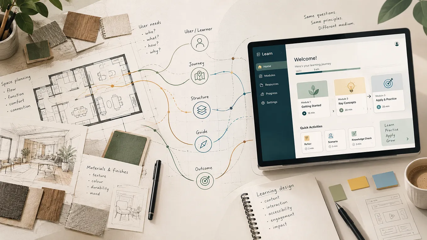
Accessibility is a vast topic, and one of the biggest challenges for me was figuring out what not to include. I had to learn how to take technical information and translate it into simple, easy-to-understand language for a non-expert audience. At the same time, I had to cut down the content and keep only what immediately mattered to the learners and the ultimate goal of the course.
Get Sakina Shoque’s stories in your inbox
Join Medium for free to get updates from this writer.
That same discipline carried into the design itself. I kept checking each piece of content, interaction, and activity against the learning objectives. If something looked good on paper but didn’t contribute to what the learner needed to know or do, I left it out or replaced it.
For me, that was one of the biggest lessons from this project: good instructional design isn’t about fitting in everything you know. It’s about making deliberate choices about what learners need, what they can realistically process, and what will help them do something differently.
I talk about this in more detail in the full case study, where I walk through the project from needs analysis to design, storyboarding, and the evaluation plan.
Check out the case study here: Accessibility Basics for Small Business Owners
I’d also love to hear how you approach designing for learners who have very little time, so feel free to share your thoughts in the comments.