The Font Your Screen Reader Actually Sees


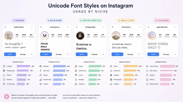
Find a profile with one of those cursive or bold names — you know the ones, the styled text that looks like someone unlocked a secret font Instagram forgot to include. Now imagine hearing this instead of seeing it:
“Mathematical sans-serif bold capital H. Mathematical sans-serif bold small e. Mathematical sans-serif bold small l. Mathematical sans-serif bold small l. Mathematical sans-serif bold small o.”
Five characters. Five full phrases of Unicode nomenclature. For the word “Hello.”
That is what a screen reader announces. Not approximately. Not a simplified version. That exact sequence of words, for every single styled character, every time.
I Did Not Think About This Until I Had To
I will be honest. When I first started working with Unicode text styling, accessibility was not on my radar. I was thinking about character maps, rendering consistency, cross-device testing. The question “what does this sound like?” never occurred to me.
It occurred to me when a user emailed to say they could not understand their friend’s Discord server because every channel name was in styled text and their screen reader turned the entire channel list into a wall of “mathematical sans-serif bold small” repeated hundreds of times.
I felt stupid. Not because the problem is hard to understand — it is immediately obvious once you think about it — but because I had never thought about it. I had built a tool that generates styled text used by hundreds of thousands of people, and I had not once considered what that text sounds like to someone who cannot see it.
Why It Works This Way
Screen readers are built to be precise. Their entire purpose is telling the user exactly what is on screen, character by character if necessary. When a screen reader encounters U+1D5D4, it does not guess that the user probably meant “A.” It announces what U+1D5D4 actually is: Mathematical Sans-Serif Bold Capital A. That is the character’s official name in the Unicode standard.
For regular text, this precision is exactly right. “A” is announced as “A.” “é” is announced as “e with acute accent.” The screen reader user hears what the sighted user sees. The system works.
Mathematical characters break the system because their names are technical labels written for standards documents, not for human ears. Nobody at the Unicode Consortium sat down and thought “someday millions of people will use these in Instagram bios and screen readers will need to announce them in a way that makes sense.” They named the characters for their intended use — mathematics papers — where nobody would ever need them read aloud.
The Numbers That Got To Me
There are roughly 8 million screen reader users worldwide. I do not know the exact number on Instagram — nobody publishes that breakdown — but even conservative estimates put it in the hundreds of thousands.
Meanwhile, somewhere between 15 and 25 percent of Instagram bios with more than a thousand followers contain styled Unicode text. I counted this manually across 500 accounts last month and was surprised it was that high.
So there are hundreds of thousands of screen reader users on a platform where a quarter of established profiles have bios that are partially or fully unintelligible to them. And the people creating those bios — including me, until that email — had no idea.
Discord is worse. I spent an hour navigating Discord with a screen reader as an experiment and I do not recommend the experience. Server names in Fraktur. Channel names in small caps. Role names with crown symbols. Display names with sparkle frames. Every single one of those elements becomes a cascade of Unicode nomenclature. Finding the actual chat messages underneath all of that styling is exhausting.
What I Keep Thinking About
The part that bothers me most is not the technical problem. The technical problem has solutions — platforms could normalise styled characters for screen readers, or add aria-labels with plain text equivalents, or warn users when they paste styled Unicode into a bio field.
Get james Willey’s stories in your inbox
Join Medium for free to get updates from this writer.
What bothers me is that none of them do. Instagram has not added any mitigation. Discord has not added any mitigation. TikTok has not. X has not. These are companies with dedicated accessibility teams and billions of dollars in resources, and styled Unicode text has been common on their platforms for years.
I do not know why. Maybe they consider it a Unicode problem rather than a platform problem. Maybe the user population affected is too small to prioritise. Maybe they just have not gotten to it. Whatever the reason, the result is the same: the accessibility cost of styled Unicode text is completely unmitigated by every major platform in 2026.
What I Changed In My Own Approach
After that email, I spent a week thinking about what a responsible text styling tool should do differently. Here is where I landed — and I will be honest that I still have mixed feelings about some of these choices.
I tell users. Not with a popup. Not with a guilt trip. Just a line near the output that says something like: “Screen readers may announce styled characters by their full Unicode names. Consider using plain text for important information.” Most users will ignore it. Some will not. That is enough.
I recommend styling one thing. A name. A tagline. One short phrase. If a bio has four lines, three of them should be plain text. A screen reader user will hear Unicode nomenclature for one word and then three lines of perfectly readable content. Not ideal. Better than four lines of nomenclature.
I tell users to keep hashtags plain. This one is not even about accessibility — it is about functionality. A styled hashtag is a different tag from its plain equivalent. #𝗙𝗮𝘀𝗵𝗶𝗼𝗻 reaches nobody. #Fashion reaches the hashtag’s audience. But the accessibility benefit is a bonus: screen readers handle plain hashtags correctly.
The Gap Nobody Fills
Here is the uncomfortable bit. Instagram, Discord, TikTok — they could fix this tomorrow. Not the Unicode standard. Not the screen reader software. The platforms.
If Instagram added native bold and italic to bios — real formatting, not character substitution — the text would render as styled for sighted users and as correctly labelled text for screen readers. HTML has had semantic bold and italic for three decades. Markdown supports them. Every word processor supports them. Social media bios do not.
Users reached for Unicode character substitution because platforms gave them nothing else. The accessibility cost was an accident — the unintended consequence of solving a problem (I want my bio to look different) with the only tool available (swap the characters for ones that look different).
I do not blame the users. I do not even blame the tool builders — though I now think we have a responsibility to surface the trade-off rather than hide it. I blame the platforms for creating the gap and then walking away from the consequences.
The Thing I Cannot Unsee
I cannot look at a styled Instagram bio the same way anymore. Every cursive name, every bold tagline, every sparkle-framed display name — I hear the screen reader version in my head now.
“Mathematical script small y. Mathematical script small o. Mathematical script small u. Mathematical script small r. Space. Mathematical script capital n. Mathematical script small a. Mathematical script small m. Mathematical script small e.”
Your Name. Eight characters. Forty-seven words of Unicode nomenclature.
I keep coming back to that ratio. Eight characters. Forty-seven words. And nobody told the person who styled their name that this is what it sounds like on the other end.
Now you know. What you do with that is up to you — but at minimum, maybe style a little less and keep the important parts plain. The person listening will appreciate it more than you think.
About author:
I am James Willey- a UX designer, trpography nerd,and the kind of person who notices when a font renders differently on iOS and Android.Based in London.’’