The Button Is Not Just a Button


A button is one of the simplest things we build on the web.
At least, that’s how it looks.
You write:
<button onClick={handleSave}>
  Save
</button>
You style it.
You wire up the handler.
You move on to the next task.
But imagine you’re building a checkout experience and adding a Pay Now button just like this.
A couple of days later, Customer Support escalates a critical issue:
Some customers are being charged multiple times for the same order.
The payment API wasn’t the problem.
The database wasn’t the problem.
The problem was the button.
The payment request took a few seconds to complete. During that time, users clicked Pay Now, saw no immediate feedback, assumed their click hadn’t registered, and clicked again.
And again.
The button looked perfect from a UI perspective, but it was missing some critical behavior:
- No loading state
- No disabled state
- No protection against duplicate submissions
- No clear feedback that the payment was being processed
The implementation had satisfied the design.
It had failed the product.
That distinction changed the way I think about frontend engineering.
A button isn’t just a visual element with an onClick handler. It sits at the intersection of user behavior, application state, network latency, error handling, accessibility, and business logic.
And that’s when I started realizing:
Frontend engineering isn’t about making the UI look right. It’s about making the UI behave correctly.
It looks simple.
But in a production application, a button is rarely just a button.
- What happens when the user clicks it twice?
- What happens when the API takes three seconds?
- What happens when the request fails?
- What happens when a keyboard user reaches it?
- What happens when it opens a modal?
- What happens when analytics needs to track it?
- What happens when 50 teams across an organization need to use the same component?
Suddenly, the button isn’t so simple.
And that’s the interesting part of frontend engineering:
Simple UI does not necessarily mean simple engineering.
1. The Semantic Contract
One of the first mistakes developers can make is thinking about a UI element primarily in terms of how it looks.
You look at a Figma design and think:
“How do I make this look like a button?”
That can lead to something like:
<div className="btn-primary" onClick={handleSave}>
  Save
</div>
Visually, it might be indistinguishable from a real button.
A mouse user can click it.
So what’s the problem?
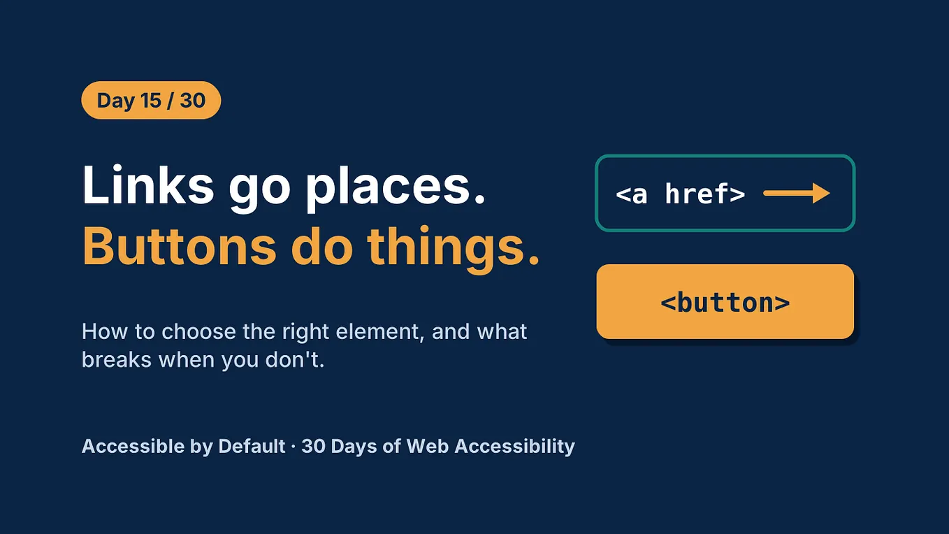
The problem is that we’ve implemented the appearance of a button without implementing its semantic contract.
Compare that with:
<button onClick={handleSave}>
  Save
</button>
The browser already understands what this element is.
A native <button> participates in the browser's interaction model and accessibility semantics. Keyboard users can interact with it, assistive technologies understand it as a button, and the browser provides behavior that we'd otherwise have to recreate ourselves.
With a <div>, developers often start adding:
<div
  role="button"
  tabIndex={0}
  onKeyDown={handleKeyDown}
>
  Save
</div>
Now we’re manually rebuilding behavior that the platform already provides.
That’s a useful frontend engineering principle:
Use the platform’s semantics before trying to recreate them yourself.
Don’t start with:
“How can I make this look like a button?”
Start with:
“What is this element semantically?”
Then style it.
2. A Button Has States
Once we’ve established the semantic foundation, we have another problem:
A button isn’t always in the same state.
Consider a Save button.
At minimum, it might have:
Idle
  ↓
Loading
  ↓
Success
  ↓
Idle
Or:
Idle
  ↓
Loading
  ↓
Error
  ↓
Retry
  ↓
Loading
There can also be:
- disabled
- focused
- hovered
- pressed
- loading
- success
- error
So the component isn’t simply:
Button → ClickIt’s closer to a small state machine.
                    ┌───────────┐
                    │   Idle    │
                    └─────┬─────┘
                          click
                            ↓
                    ┌───────────┐
                    │  Loading  │
                    └─────┬─────┘
                     ┌────┴────┐
                     ↓         ↓
                  success     error
                     ↓         ↓
               ┌──────────┐ ┌──────────┐
               │ Success  │ │  Error   │
               └──────────┘ └────┬─────┘
                                  ↓
                                retry
                                  ↓
                               Loading
Once you start thinking this way, new questions appear.
Should the label change from:
Saveto:
Saving...Should the button remain the same width so the layout doesn’t shift?
Should the user still be able to focus it?
What happens if the request fails?
Can the user retry?
Should the success state be communicated to assistive technology?
The visual component hasn’t changed much.
The behavioral requirements have.
3. disabled Is a Behavior, Not Just a Style
A common implementation is:
<button disabled={isSaving}>
  {isSaving ? "Saving..." : "Save"}
</button>
That’s often exactly what you want.
But it’s important to understand what disabled actually means.
A native disabled button isn’t simply:
“A button that looks grey.”
It changes how the browser treats the control.
A disabled button cannot be activated and, in typical browser behavior, is removed from sequential keyboard navigation.
Now compare that with:
<button aria-disabled={isSaving}>
  Save
</button>
These are not equivalent.
aria-disabled="true" communicates an accessibility state, but it does not provide the native behavior of disabled.
The button can remain focusable, and your application is responsible for preventing the action.
For example:
<button
  aria-disabled={isSaving}
  onClick={() => {
    if (isSaving) return;
    handleSave();
  }}
>
  Save
</button>
So the decision isn’t simply:
“Which one looks better?”
It’s:
What interaction behavior do we actually want?
That distinction matters when designing reusable components.
4. The Duplicate-Submission Problem
Now let’s return to my checkout example.
A naïve implementation might be:
async function handlePay() {
  await processPayment();
}
The user clicks:
Pay Now
   ↓
API request
   ↓
...waiting...
Nothing appears to happen.
So they click again.
And again.
A better implementation introduces a loading state:
const [isProcessing, setIsProcessing] = useState(false);async function handlePay() {
if (isProcessing) return; setIsProcessing(true); try {
await processPayment();
} finally {
setIsProcessing(false);
}
}
And:
<button
  disabled={isProcessing}
  onClick={handlePay}
>
  {isProcessing ? "Processing..." : "Pay Now"}
</button>
Now we’ve improved the UX considerably.
But there’s an important architectural lesson here.
Is this enough to guarantee that a customer won’t be charged twice?
No.
The frontend is an unreliable boundary.
Users can:
- double-click
- refresh the page
- open multiple tabs
- lose network connectivity
- retry requests
- navigate backward and forward
The backend should therefore have appropriate safeguards for operations such as payments — for example, idempotency mechanisms.
The frontend can prevent accidental interactions.
The backend must protect the business operation.
Frontend state can improve the user experience, but it should not be your only line of defense against duplicate operations.
That’s the difference between solving a UI problem and solving the system problem.
5. Focus Is Part of the Interaction
Now imagine that the button opens a modal:
<button onClick={openModal}>
  Delete Account
</button>
The implementation may be only one line.
But the interaction is much bigger.
The user clicks the button.
The modal opens.
Where does focus go?
Once the modal closes, where does focus return?
A well-designed modal interaction generally needs to manage focus appropriately so keyboard and assistive-technology users aren’t left somewhere unexpected.
The interaction becomes:
Delete Account button
        ↓
     Open modal
        ↓
   Move focus appropriately
        ↓
   User confirms/cancels
        ↓
     Close modal
        ↓
Return focus appropriately
This is why accessibility isn’t simply:
“Add ARIA attributes.”
Accessibility is fundamentally about how people interact with the system.
And that interaction spans components.
The button is part of the interaction even though the complexity may actually live in the modal.
6. Events Have Boundaries
Consider a clickable table row:
<div onClick={openDetails}>
  <span>Order #1234</span>
  <button onClick={deleteOrder}>
    Delete
  </button>
</div>
The user clicks Delete.
What should happen?
Only the delete action?
Or should the row also open its details?
Because DOM events bubble, the button’s click can reach the parent.
You might need:
<button
  onClick={(event) => {
    event.stopPropagation();
    deleteOrder();
  }}
>
  Delete
</button>
But there’s a bigger lesson here.
Whenever interactive elements are composed together, you need to understand their event boundaries.
Get Ramya Selvaraj’s stories in your inbox
Join Medium for free to get updates from this writer.
This applies to:
- menus
- cards
- tables
- dropdowns
- nested controls
- modals
- drag-and-drop interfaces
A component doesn’t operate in isolation.
Its behavior is affected by the components around it.
7. The User Doesn’t Have One Input Device
Another easy assumption is:
“The user clicks the button.”
But users don’t all interact with interfaces in the same way.
They may use:
- mouse
- keyboard
- touch
- stylus
- screen reader
- other assistive technologies
That changes the engineering requirements.
An Engineer isn’t thinking:
“My mouse click works.”
They’re asking:
“Does this interaction model work across input modalities?”
That can influence:
- focus behavior
- keyboard interaction
- touch target size
- hover-dependent behavior
- pointer events
- pressed states
- mobile interactions
The button may still be 100 pixels wide.
But the engineering problem is much larger than those 100 pixels.
8. Analytics Changes the Problem
Now imagine the product team says:
“We need to track when users click Save.”
The obvious implementation might be:
<button
  onClick={() => {
    track("save_clicked");
    handleSave();
  }}
>
  Save
</button>
But what exactly are we measuring?
A click?
A successful save?
A failed save?
A validation failure?
A request that was cancelled?
Those are different events.
Consider:
User clicks Save
       ↓
Validation fails
Did the save happen?
No.
Did the user attempt to save?
Yes.
Now:
User clicks Save
       ↓
API request
       ↓
Server error
The user attempted the operation, but the operation failed.
So analytics isn’t simply:
“Put tracking inside the click handler.”
It’s another example of defining behavioral contracts.
You need to establish what the events actually mean.
9. Scaling the Button Across an Organization
Now imagine you’re working in a large organization.
You don’t have one button.
You have hundreds of buttons across dozens of applications.
Without a design system, you might see:
<button className="blue-button">somewhere else:
<button className="primary-action">and somewhere else:
<button style={{ background: "#0066cc" }}>They may all mean the same thing.
This is where component architecture becomes important.
Instead of exposing implementation details:
<Button
  color="blue"
  width="120px"
  padding="10px"
/>
a design-system API might look more like:
<Button
  variant="primary"
  size="medium"
  loading={isSaving}
>
  Save
</Button>
Why is that better?
Because the component API expresses intent rather than implementation.
You’re not saying:
“Make the background blue.”
You’re saying:
“This is a primary action.”
Now the design system can change what “primary” means without forcing every consumer to update its implementation.
That’s an important abstraction boundary.
10. Reusability Is More Than Reusing Code
A component isn’t truly reusable just because multiple applications can import it.
A reusable component needs a clear contract.
For example:
<Button
  variant="primary"
  size="medium"
  loading
>
  Save
</Button>
raises questions that the design-system team needs to answer:
- What happens when
loadingis true? - Is the button automatically disabled?
- Is the original label preserved?
- How is loading communicated?
- Can the button receive focus?
- What happens when
disabledandloadingare both true? - What happens if an icon is provided?
- Can the component render as a link?
- What variants are supported?
- Which props are intentionally not supported?
The component API becomes a contract between teams.
And contracts matter much more as an organization grows.
11. Testing the Contract, Not the Implementation
A fragile test might look like:
expect(button).toHaveClass("primary-button");But CSS classes are implementation details.
A better test asks what the user can actually do:
expect(
  screen.getByRole("button", { name: "Save" })
).toBeEnabled();
Then we can test behavior:
✓ button has the correct semantic role
✓ button has an accessible name
✓ button can be activated
✓ loading state prevents duplicate actions
✓ disabled state prevents interaction
✓ errors are handled correctly
✓ keyboard interaction works
✓ focus behavior works
The principle is:
Test the contract, not the implementation.
This makes tests more resilient when the underlying implementation changes.
12. The Button Is a Small System
At this point, the original component:
<button onClick={handleSave}>
  Save
</button>
has turned into something much richer.
You can think about it across several dimensions:
BUTTON
                            │
       ┌────────────────────┼────────────────────┐
       │                    │                    │
   Semantics              State              Interaction
       │                    │                    │
   HTML                  Idle                 Click
   ARIA                  Loading              Keyboard
   Role                  Success              Touch
   Focus                 Error                Events
       │                    │                    │
       └────────────────────┼────────────────────┘
                            │
                     Production Concerns
                            │
              ┌─────────────┼─────────────┐
              │             │             │
          Analytics      Testing       Design System
              │             │             │
          Events         Behavior       API
          Success        A11y           Tokens
          Failure        States         Variants
The HTML element is tiny.
The system around it isn’t.
The Engineering Perspective
The difference isn’t necessarily how much code you write.
It’s how many questions you ask before you write the code.
A button can be implemented in a few lines:
<button onClick={handleSave}>
  Save
</button>
But an engineering perspective looks beyond those lines.
Before implementing it, you start asking:
- What is this element semantically?
Is a native<button>the right choice, or are we unnecessarily recreating browser behavior? - What states can it have?
Is it idle, loading, disabled, successful, or in an error state? What happens during each transition? - What happens when something goes wrong?
What if the API is slow? What if the user clicks twice? What if the request fails? What happens if the user refreshes the page? - How does it work for different users?
Can someone navigate to it with a keyboard? Is focus handled correctly? Does the interaction make sense with touch or assistive technology? - What happens when it is composed with other components?
Could event bubbling trigger an unexpected action? Does opening a modal require focus management? - What does the component’s API communicate?
Are we exposing implementation details like colors and padding, or are we expressing intent through concepts such asvariant="primary"andsize="medium"? - How will this behave at scale?
Is this component going to be used by one team, or will dozens of teams depend on it? How do we keep the contract consistent while allowing the component to evolve? - What exactly are we testing?
Are we testing that a CSS class exists, or are we testing the behavior and accessibility contract that the component promises? - What are we measuring?
If analytics is required, are we tracking a click, an attempted action, a successful operation, or a failure?
None of these questions necessarily make the button bigger.
They make our understanding of the button deeper.
That’s the engineering perspective.
It’s moving from:
“How do I implement this UI?”
to:
“What behavior, constraints, and failure modes does this UI need to handle?”
And that shift applies far beyond buttons.
The same thinking changes how we build forms, modals, dropdowns, search experiences, tables, navigation, and entire frontend systems.
Good frontend engineering isn’t just about making the UI work.
It’s about understanding everything that “work” actually means.
The Bigger Lesson
The button is only an example.
The same thinking applies to almost every component we build.
A form isn’t just a collection of inputs.
A dropdown isn’t just a list that opens.
A modal isn’t just a div with position: fixed.
A search box isn’t just an <input>.
A table isn’t just rows and columns.
A loading spinner isn’t just an animation.
Each seemingly simple component sits on top of a network of:
- states
- interactions
- accessibility requirements
- browser behavior
- performance considerations
- API contracts
- failure modes
- analytics
- testing requirements
- architectural boundaries
And that’s what makes frontend engineering interesting.
The hard part isn’t always writing the code.
Sometimes the hardest part is realizing what the code needs to account for in the first place.
So the next time you see:
<button>Save</button>don’t dismiss it as simple.
Ask:
What does this button mean?
What states can it enter?
What can go wrong?
Who can interact with it?
What happens when the network is slow?
What happens when the user clicks twice?
What contract does it expose?
What happens when 50 teams depend on it?
Because in production software:
The button is never just a button.