What’s for Dinner: Meal Planner Pro App

An app that makes it easy to plan for dinner.
Project Date: Fall 2024
Project Overview: For my final project in Native App Development, I created the What’s for Dinner: Meal Planner Pro app, designed to help users with dinner options using everything we’ve learned throughout the course. The task was to create something compelling, make it work, then make it work better.
The Challenge: My goal for this project was to do something creative, fun, and solution-based using an API. Although I enjoy cooking, I absolutely dread the planning process because I never know where to start. My tastebuds are always all over the place, which makes it hard me for to decide what I want for dinner (hence the name). So, I wanted to create something that I could see actually see myself using, and hopefully several others.
The first part of the project, Phase 1, was to take all the concepts we’ve learned throughout the semester to create a fully functional and well-designed app ready to be published. We were not to use AI of any sort—just simply rely on material from the textbook. Then, we were tasked with taking the app we create to the next level by using any online resources available to us, including AI.
As I got started on Phase 1, I immediately knew I wanted to use some sort of API to achieve the goal of my app. I explored meal APIs and came across The MealDB’s free recipe API. As you can see in the screenshot below, this particular website offers several options where you can choose how you want to display the recipe (filter by ingredient, first letter of the meal, particular region area, etc.).

After finding the perfect API website to use, I created sketch of how I wanted the layout of my app to appear. Although the sketch itself was pretty terrible, this really helped me get started when it was finally time to build everything out in Xcode. I knew I wanted pictures, so I went ahead and pulled those. I knew I wanted a solid color palette, so I created that. And since there were several different ways I could use the API, I knew I wanted my app to provide users with a few different recipe and/or meal options.
From there, it was time to actually code, starting with the landing page, which also doubles as the navigation page for users. Using my sketch as a guide, I knew I wanted the title of the app at the top, a few pictures just below, a brief summary of what the app does, and provide the user with three options as shown in the screenshot below.

I believed this particular setup showed my understanding of the basic concepts we learned earlier in the semester, including user layouts with stacks and working with images and text. I even took it step further to expand on our lesson with buttons by adding two navigation buttons at the bottom—one to get users started and the other to help users learn more about the app.
The Get Started button allows users to choose the option best for them, using a design I was able to recreate from Exercise 2 in Chapter 4 of the textbook. I read through more of Chapter 28 to help me build the FAQ page, which is where the Learn More button will take users.


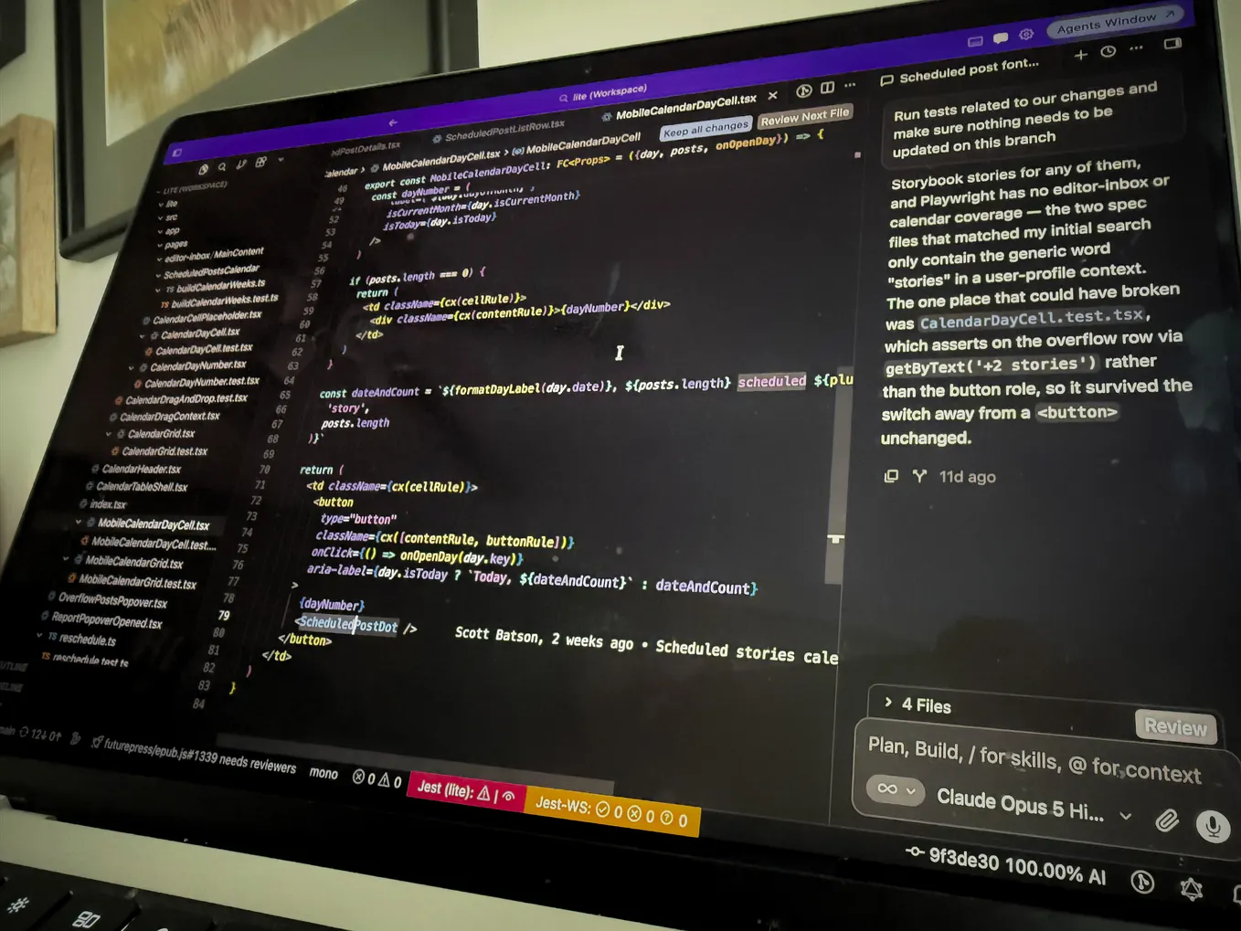
Moving on to the meat of the project, and honestly the biggest challenge for me, getting each API to work properly. I decided to use the API that displayed random meals for my Recipe Roulette feature, and the API that filters by main ingredient for the Discover Meals option. I struggled initially with getting data to display for Recipe Roulette from my code using the Pokémon API lesson as a guide. So, with permission to use outside resources to troubleshoot with this portion only, I was able to finally display the data. I learned that the Pokémon API returned the data in a list, which is not what I wanted to do for this particular feature, and part of the reason why the code did not easily transfer over. Also, APIs from The MealDB contain arrays, and since I only wanted to display a single recipe at a time, the code needed to reflect that.

As you can see in screenshot above, I didn’t have much left in the tank to focus on the design aspect for the Recipe Roulette feature. I knew this would be one of the first things to address in Phase 2, which I’ll expand upon in The Solution.
Get Taejah Harper’s stories in your inbox
Join Medium for free to get updates from this writer.
I’m most proud of the option to Discover Meals. Here, users select their protein, and the API pulls over a list of meal ideas to get them started on what could potentially be for dinner. Getting data to display for this API was much easier than in Recipe Roulette because this time I did want to incorporate a list. I also leaned heavily on the lesson from Chapter 13 of the textbook, as well as the SwiftUI Picker lesson on Code with Chris.

I’ll admit that I also could have designed this much feature much better than I did, but I was pretty excited to get everything functioning that I didn’t want to mess anything up.
Last but not least is the Grocery Store feature, that allows users to find grocery stores near them. That way, if they find a recipe but don’t have the ingredients they need, they can easily get them nearby. I received great feedback on the Map feature I included in my midterm project, so I want to expand on that more. This was probably the page I had the most trouble designing and used Phase 2 to improve that.


The Solution: Phase 2 of this final project required us to be able to effectively leverage all of our resources to take our work to the next level. I was pretty satisfied with the functionality of my app in Phase 1, so I used Phase 2 to focus on more user-friendly designs. One thing that really bothered me on the landing and option pages was the amount of repetitiveness users had to go through in order to get started with the app. So, I used AI to help think through ways to simplify the process and make the app experience smoother.

In order to accomplish a more streamlined process, I added a button component to replaced the separate OptionView. I also moved the “Learn More” button to a floated position so that it doesn’t crowd the main content and keeps the focus on the primary three action buttons without crowding the main content. I felt theses changes allows the use to get to what they need faster, with fewer steps.

For the FAQ page, I wanted less white space and arrows that matched my color palette. With AI assistance, I discovered that I needed to apply the my color palette color to the entire DisclosureGroup holding each question. I also needed to add the .accentColor modifier to the List view to change the color of the disclosure arrow.
Remember Recipe Roulette that gave me trouble? Well, since I was able to get the API to function properly, I wanted to pull in more components from the data set to style the page better.

The data set included a thumbnail of the meal, which I added to the code in Phase 2 using AsyncImage. User readability was also lacking on this particular page, so the recipe title, image, and instructions are all spaced out nicely for better layout.

I’m most pleased with the design restructure of the Grocery Store finder feature in Phase 2. The original code listed all the grocery stores in one section. In Phase 2, I added headers for better organization. The updated code also has each grocery store designed in a card-like format for clear separation and better readability for the user.
Results: Overall, I’m extremely proud of myself for the work I produced for the final project. From the title, to the functionality and design, it took a lot of work and trial and error, but I tacked each problem head-on. It was also interesting and quite a learning process leveraging resources like AI to make the project better. However, I’m glad this assignment incorporated that because as it becomes more and more important to leverage these tools effectively, I now feel confident enough to efficiently make my work, work better. In the future, I would probably focus more on the design aspect from the beginning, but I’m really happy with the consistent, streamlined, and user-friendly design especially in Phase 2.