Niamh·11h agoThe Architecture of Attention: How Font Size Dictates Reading and Scanning BehaviorStop treating typography as just an aesthetic choice. The size of your text is the primary control dial for user cognition.
Afroza Riju·21h agoVon Restorff Effect: Why the One That’s Different Is the One We RememberPeople notice and remember what stands out from its surroundings. But the real secret isn’t the highlight. It’s everything around it that…
DJPleum·1d agoเลิกใช้สลับกัน! สรุปให้ชัด Concept vs Theme ต่างกันยังไง? ถอดรหัสวิธีคิดฉบับ DJPleumในฐานะที่ผม DJPleum ทำงานเป็นทั้ง Visual Art Director, 3D Artist และ Music Video Director…
Sudesh Kumar·1d agoYour Next Design Deliverable Could Be a WorkflowWhat Figma Weave suggests about reusable creative systems — and where a designer’s judgment still belongs
Niamh·4d agoThe Clarity Paradox: How Visual Simplicity Unlocks Product ComprehensionAdding more doesn’t help. Here is the cognitive framework for designing interfaces that users actually understand.
Jason Han·4d agoThe Scanning Eye: How Typography Transforms Complex Interfaces into Clear PathwaysStop hiding critical data in walls of text. Here is the cognitive framework for designing typography that users can actually process.
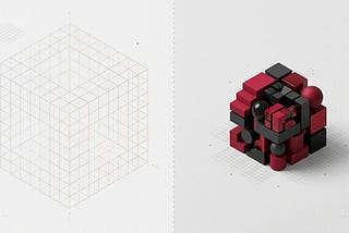
InAgent X and the Edge of RealitybyMyk Eff·4d agoThe Art of Agent X and the Edge of RealityGallery 003
Divya Kukreti·5d agoHow I Created a Fun Numbers Game in a WeekendNumooji: a fun numbers game with animal personalitiesA response icon1A response icon1
Cleo Excellen Iskandar·5d agoMendesain Form yang Membantu PenggunaSaat mendesain sebuah form, kita mungkin langsung memikirkan warna, tipografi, dan layout. Padahal, tantangan sebenarnya adalah membantu…
Edward Flynn·5d agoThe Silent Conductor: Why Visual Hierarchy Is More Than Just Making Things BiggerWe obsess over font sizes, but the true architecture of attention is built on contrast, space, and cognitive rhythm.